Data
capture is always against a delivery plan. Before beginning to report the
delivery plan dropdown in the ‘Programme Overview’ tab must have an option
selected. It is
simple to check if an option has been chosen correctly as the reporting tabs
within the Realise function of the application are hidden until an option has
been selected to report against. Ticking the 'Delivery Option can be changed'
will 'unlock' the drop down menu and allow you to select a different option.
Clicking 'No Delivery Option' will not allow access to any reports or the
Realise function.
Activity Costs
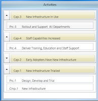
The Activity Costs tab is the third and final Realise tab. In the top left hand side of the screen, there is a box
which lists the Activities. This gives you the ‘finer’ details of the programme
versions activities: the capabilities and programme nodes. Programme nodes are
the nodes that hold the resources.
 Changing the selected
programme node in this box changes the data grid and the graph, as these report
on the selected programme node. It displays the capabilities and beneath them
the programme nodes that are required to achieve that capability.
For clarity of viewing,
you are able to minimise by Capability the nodes that you do not wish to view –
simply click the arrow to the left hand side of the Capability to expand and
collapse the programme nodes list of that Capability.
There is a Notes box beneath the Activities which can be
used to capture extra information about a value that is being added for a
resource. Note that a value needs to be added to the data grid for the notes
box to become available for editing.
Within the ribbon menu at the top of the screen there are
‘Realise Cost View’ options.
These allow rows to be added and removed from the graph and
data grid. These are ‘Realisor Expected’, ‘User Expected’ and ‘Additional
Costs’. When all these are turned off, the data grid displays only the ‘Actual’
values and the totals.
The Graph
The graph displays the costs calculated in the data grid
above it. This is a visual representation of the data grid, allowing a simple
and clear comparison of the Expected Costs, shown here in Green and the Actual
Costs, shown in purple. Lines can be added and removed using the ‘Realise Benefit
View’ options to improve the clarity of the model and to see comparisons.
The vertical lines on the graph differentiate between the
different phases of the programme. Hovering over a point on the graph will
display its exact value on the x axis.
There are many options available to change the view of the
graph. Right click on the graph and select ‘Quick Help’ to obtain the help. You
can also copy and paste the graph as an image or hover over a data point to see
the value on the x axis of the graph. Selecting the Quick Help function when you
right click on the graph will pop up the window shown in the left. This gives
information on how to zoom in and out on the whole graph and selected areas, pan
the display of the graph, fit to view and copy and save screenshots.Data Grid
This is where all the activity’s data is displayed. It includes expected, actual and variance values as well as the calculated costs. This displays all of the selected activities report data, including the expected values, the actual values, the total costs based on those values and the variance in between. When you enter data into the User Expected cell, this will overwrite the data in the Expected cell. If the current date is after the data grid column date and no data has been added, the column actual value will be auto populated with the expected value. As such, only differences in resource usage need to be added.
If requirements change and additional resources are required, these can be added to an activity through the Activity Costs screen. There is a green plus symbol above the data grid on the left hand side. This allows you to add a resource to an activity. When this is clicked, it loads the Resources screen. The red minus symbol to the top right of the graph allows you to remove a selected resource from the activity.


